To make my evaluation less boring, i tried a different appraoch to evaluating, i chose to have an interview with a possible reader of my magazine.
Monday, 9 May 2011
Evaluation - Looking back at your preliminary task, what do you feel you have learnt in the progression from it to the full project?


From the preliminary task to the main project i think i have progressed loads! i mean just seeing the photograph used in the first task and then the main photo's, in which the angles are better, even the pose is better. Then you have a colour scheme in the main task. where as in the school magazine it was just a case of whatever colour went. the plain background in the main task is so much better it makes the colour scheme easier to pick and also makes the magazine look less chaotic, unlike the first task.
Anyone can see by looking at the images of both tasks that there has been so much improvement between them!
Evaluation - What have you learnt about technologies from the process of constructing this product?
Through the production of creating a music magazine i have learnt many different things whilst in the process.


Here i am in this picture using a mac!
Through this process i have learnt how to use a mac properly Finally! However, i felt more comfortable actually making my magazine on a windows computer as i know properly how it works and how to use the majority of the programs properly. Althought, on the mac i was able to use picnik to edit my pictures which i knew a bit about already but i really got to be able to discovery different things on it. This was very helpful as the macs work very quickly and i was able to then save my photo's on my memory stick then place them into my magazine.

Sian has also taught me to use serif, which is photo editing software, which before i struggled using. However, with the help of my partner Sian, i was able to learn things on it. Too create the overall porduct we used Serif Draw Plus i already knew how to use this, meaning i felt comfortable using it
Other technology used was Sian's trusty camera a Nikon D5000, and as Sian likes to call it 'the cool one with the flippy screen.' we used this camera for all of the main images used throughout both of our magazines.

Also as sians a technical genius she has photoshop on her computer meaning we had acess to use it if we needed it, in the end we didnt need it as all of the photo's came out pretty well.
Overall i think i have learnt a lot about the technologies i have used as although when looking at them they appear scary, just sitting down and trying them out and finding out how they work make life a lot easier.
Evaluation - Who would be the audience for your media product?
Well i have already posted pictures of my ideal reader and described them many times however, incase you forgot... here is what my ideal reader should be like:
He or she would more than likely:
- Wear skinny jeans.
- have piercings.
- have tattoos.
- have dark hair
- wear heavy make up
- and most importantely they must like rock music!

An example of my ideal reader.
My ideal reader would NOT! be someone like this:
 (the picture went funny.)
Evaluation - What kind of media instituation might distribute your media product and why?
Me and Sian decided to work together for out magazine, therefore we had to make our evaluations similar to each others, by sharing the same opinions. if we got the opportunity to publish our magazine, ideally we would like Bauer publishing to distribute our product, as it is reliable for many different products including Kerrang magazine which is one of the magazines we researched then chose to base our product on.
Evaluation - How Does Your Media Product Represent Particular Social Groups?
For this part of the evaluation i decided to make a questionnaire. i chose to ask people who are interested in the genre of music that my magazine is based on and made around.
1. do you think the colours are representative of the genre of the magazine?
Yes - 5
No - 0
Opinions - 'i liked the bold style, it matches the music'
' i agree with the first comment, the bold colours are good, attention grabbing!'
' The picture is good and i like the big quotes, it suites the style of the magazine!'
2. Is the format of the magazine clear?
Yes - 5
No - 0
Opinions - 'i love the layout of the DPS and of the contents'
3. what is your overall opinion on the images used?
Good - 5
' good poses for the model, represents the attitude of the genre.'
Bad - 0
4. Are the fonts used to their advantages?
Yes - 5
No - 0
Opinions - 'nice and clear, not too formal'
' i agree completely.'
' I agree with the top. I also like the bold quotes and purple headlines.'
5. What are your opinions on all of the features used? eg. Editors note, subscribe box, title used.
- 'I like them it adds a personal sense and professional style.'
- 'I love how there is a small amount of writing, makes it easier to follow, you can look at it whilst being very relaxed.'
- 'I love the editors note, with yours and sians signiture, the contents page is really professional which is also amazing! i love how the colour scheme is suitable for the genre as well. also the fact that Avenged Sevenfold and My Chemical Romance are on the contents.'
- 'It looks very professional like an actual music magazine, a famous quote from the amazing Tom Carnell of Stereotypical Blues Train'
6. How does my magazine represent particular social groups?
- 'It's bold just like the music that is mentioned'
- 'It features people we would listen too.'
- 'It includes things that we would want to read about.'
- 'It looks very much like a teenage music magazine and if it was real i would buy it.'
Evaluation - In what Way does your media product use, develop or challenge forms and conventions of real media products.
My magazine fits well with typical conventions of music magazines. On the outside front cover (OFC) i have used three main colours for the colour scheme, this keeps it looking professional and not too chaotic. The colours i have chosen represent the genre in my personal opinion (it fits its house style.) i chose the colour black as the darkness of the colour relates well with the genre of the magazine. The other colours i have chosen are because, they are not typically gender related, and i did not want to add pressure to the potential reader. An example of this is the colour red, it stands out against the background and also does not stereotype it to belong to either genre.
Another way my magazine sticks with conventions on the OFC is with the images used. The man image used is a mid shot, of my model Chloe Wiltshire, she is pulling an aggressive pose. the aggression is important in rock magazines as this is how the genre is usually portrayed through the media. Other images used are the poster images, these are all taken by me! Including the poster images works as a persuasive technique used to draw the readers attention. it persuades the reader to buy the magazine, as receiving free things with something you buy, is known as an audience pleasure, making the reader feel good that they are getting something for free. Also on the top and bottom there are bars which include sell lines, these are usually featured on most magazine front covers.
On the contents page there are many things that help keep it conventional. An example of this is the columns showing it to look presentable and professional. The fonts that i have used keep it the same atmosphere throughout the magazine. For the article and detail writing i chose to use a simple font of Arial. then for sub headings i used Rockwell Extra Bold. then for the name of the magazine i have used Heather BN. This keeps things consistent throughout the magazine.
As i tried to keep the double page spread (DPS) similar to Kerrang and Rocksound the magazine which i am basing mine on. i have to keep many features the same. an example of this is the large image in the interview alongside with a smaller one above the article. i included page numbers to interlink all the pages together, meaning i mentioned how the article would be featured on page 12, therefore i had to include this. I wrote the article in columns to make it look professional. I then had to draw the attention of the reader, i did this by using a pull quote above the article saying 'Scarlet fever plot global domination...'
Friday, 6 May 2011
MY FINISHED MAGAZINE- RIOT!
I have finally finished my magazine and overall i am very impressed with the finished piece.
Here are some images of my magazine:
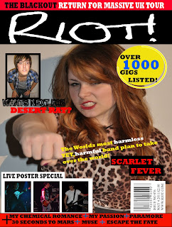


Here are some images of my magazine:


Memes and Tropes
Intertextuality – is the way that the media deliberately ir accidentally references other texts within their own.
Meme- is an element or idea that its transmitted or evolves in a culture. It is similar to a stereotype. In music, different fashion styles will be the meme. For example, people who are interested in rock music, generally you would expect them to have long black hair, dark clothes piercing’s and tattoos. In a previous post I have shown my ideal reader, she has this meme / stereotype.
Tropes- This is a recurring element in art of culture. An example of this is in films. In fantasy films, medieval is a trop of this, an example of this is Harry Potter, it is a fantasy film, yet all of its locations are based around medieval settings. Sometimes Tropes are rewritten this is called Revisionism. Tropes generally endure because the audience prefer them, they are conventional. From my experience in life, its conventional to use black on rock magazines, even if there are many other colours on the magazine black will always be the base colour underneath everything else. An example is on my magazine I am going to use the typical colours of a rock magazine (as this is the genre of my magazine)which include red, yellow and blue and of course the dominant colour black.
FRONT PAGE IMAGE!!!

This is the image i am using on my front cover. My model is Chloe Wiltshire. i got her to do this pose as it represents rock music in the way it is typically portrayed, 'violent'.
Thursday, 28 April 2011
Magazine Font, decided.

1. Copa Sharp BTN
2. Undercurrent BTN
3. Snap ITC
4. Heather BTN
5. Smashed SF
These were the possible fonts we were going to use for out magazine title, in the end we decided on number 4 'Heather BTN', we chose this as it is a hand written font, possibly representing signitures, also it looks slightly scruffy showing the typical stereotypes of how people in the rock genre tend to care less about their appearence.


The Name For Our Magazine!!!
We have decided on a name for our magazine through a servey, there were two different names that we liked, therefore we asked our media group and some other people who were interested in the genres of music our magazine.
The two choices were AMPLIFIED or RIOT!.
We then each chose oir favourite and then passed it round the class.
so.... The name of our magazine is...
RIOT!
This name is inspired by gigs. As the majority of people that like the kinds of music we shall be basing our magazine around attend gigs, at these gigs, things can get very cramped and the crowd mosh causing chaos and violence.
Monday, 4 April 2011
Photo Shoot- Abandoned house.


These are the photo's that sian will be using for her magazine, there are two of each photos showing how she has edited them to make them look more professional.


Monday, 28 March 2011
Pictures Me and Sian shall be using.
As me and Sian are music lovers, we tend to go to gigs quite often, therefore taking pictures. We feel that now is the perfect time to use these photos for our contents page.


(top to bottom)Ben Mount (Pendulum), Simon (young guns) , John (young guns), James (Deaf Havana), Gustav (Young Guns).


Thursday, 24 March 2011
Things to consider when making the contents page
When making the contents page we need to keep the conventions going from the OFC to the DPS.
- Keep the colour scheme the same from the front with a maximum of 3 main colours.
- Images used to keep the reader interested.
- Different pages under different sup-headings to make the contents easy to follow.
- still make sure that black is the base colour.
- highlight the things featured on the front cover.
- if we decide to keep to following kerrang's ideas then make sure that there is the editors comment on this page.
- in most magazines there is a page about winning 'goodies' make sure we keep to these conventions.

Wednesday, 23 March 2011
Risk assessment
Although doing a risk assessment seems unnecessary for a magazine photo shoot this would be done by professionals in this business.
- The house is half burnt down therefore unstable.
- Rubble is all over the floor making it uneven and unsafe.
- many tripping hazards.
- unstable floor on the top floor (half is burnt away.)
- glass and nails are on the floor in places making it dangerous.
When taking the photo's we will have to ensure we are being careful not to injure ourselves by watching where we are walking and wearing sensible shoes and clothes to make sure we are unharmed.
Thursday, 10 March 2011
Recce
As me and Sian are working together, we had to plan where we are going to be taking the pictures. Also at the same time having to do a risk assesment on the locations. Here is where we are going to be taking the pictures.


The derelict building in which we are taking the pictures portrayed the bands genre well as in the media rock music is shown as messy and run down where as pop music has to be perfect.
Thursday, 24 February 2011
My ideal reader for my magazine.


This is my ideal reader. The models style matches the genre that i want my magazine to be. She has stereotypical features of a so called 'Greb' but also has her individual characteristics.
Readers of my magazine are likely to :
- Have facial Piercings.
- Wear skinny jeans.
- Have side fringes.
- lots of eye make up.
- wear dark colours mixed with few really bright colours.
- Dark hair backcombed maybe?
- want to be seen as individual.
Thursday, 17 February 2011
Investigating two music magazines (Rocksound)
I have also chosen to base my music magazine on some of the themes within Rock Sound


For my research i have taken some inforation from Rock sound's website,

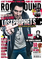

Over the years Rock Sound has changed it's layout many times. The first ever issue of Rocksound was released in March 1999, however i was unable to find the outside front cover of this and the earliest issue i could find was June 1999 (on the left). Rock Sound has progressed through the years and now looks like this (on the right). The Magazine when it first started had a banner behind the title of the magazine and now with modern technology has evolved to putting peoples heads over the top of the title, they can only do this as it is so well recognised. If it wasnt well recognised people would not pick it up so easily. The Title of the magazine is self explanatory as it states the genre of music that it is about in the title. Throughout all the issues of Rock Sound i have seen there is a lot of bold and bright colours used and contrasted with dark colours. For example the issue above using black and pink. Rock Sound is a British magazine which features alternative music. The magazine aims at being more 'underground' and less commercial whilst continuing to still feature more well known acts. The Uk Edition of Rock Sound was launched in march 1999 by the French publisher Editions Freeway, who had already published the magazine in France.
Just like Kerrang, Rock Sound appears very cluttered throughout the magazine. It even had its own trademarks through the magazine, for example the fonts and colours are all similar, and only consists of a colour scheme of white, black and red which keeps it looking consistant and formal throught the article.
Wednesday, 16 February 2011
Deconstructing celebrities images.


Many stars today take various different approaches to how they live their lifestyles and how they wish to be portrayed through the media, some wish to be seen as outrageous and live their lives through the media, whereas others wish to live their private lives away the limelight.

In todays world the majority of people have heard of Lady Gaga this is because:
- She wears outrages outfits.
- goes overboard with her make up and hair styles.
- lives the life of a rockstar (with drink and drugs) even though she is not thought of being under that genre.
- She tries too hard not to fit in.
- Gets the attention from the public from through stories in the paper of magazines. For example her illness Lupus, and also through the differentoutfits she wears like the meat dress or bubble dress.

 i took this picture proud much? :D ...
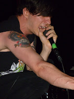
Most modern rock stars are not that well known as rock music these days is not considered to be 'mainstream'. These days rock stars tend to live their life outside the limelight and prefer their lives this way.
He fits the typical rock genre because:
- Of the clothes he wears his skinny jeans and 'drop dead' t shirt.
- The style of his hair (side fringe).
- The way he is stood even shows that he is a rock star as he looks confidant.
- the way he is posed with his fist clenched around the microphone which looks slightly aggressive.
- He has tattoos (not that in these pictures they are showing).
- He tends to stage dive into the crowd.
- Violent pose crouched down to show passion for the music.
- You can't see it in this picture but he is wearing another bands t shirt which is an example of intertextuality.
Thursday, 27 January 2011
Music Genres
A genre is a type of music, for instance Rock.
Sub-genres are types of music that beong to the main genre eg metal, heavy metal, emo, pop-rock, alternative.
Music and Lifestyle
Music is about more than just the music itself, it is also about the lifestyle.
The music you like today is regarded as a major part of your lifestyle. It can affect the way you dress, think or act. Often the style is derived from particular artists or other famous individuals.
Music may be aimed at a specific target audience or demograpghic. In order to sell music and related products like magazines and dvds to an audience, media companies like to know who they are selling to, as this helps them advertise the product effectively. This is their typical consumer.
It is important that you recognise that any generalisations about an audience will not be true of every single consumer.
In media studies we talk about the penumbra effect, the people 'in the shadow' of the larger group, who still consume a text- the 65 year old who watches Top of the Pops, the black fan of irish folk music.
This information will be helpful to us as when making a magazine, we will have to bare in mind the lifestyles and genres related to rock music to produce an accurate magazine.
Wednesday, 26 January 2011
Investigating two music magazines (Kerrang)
I have chosen to base my magazine coursework on Kerrang and have therefore researched into the magazine.


Over the years Kerrang has changed it's layout many times. The first ever issue of Kerrang was released in June 1981 (top left) to a very recent copy that was released on the 12th January 2011. The name Kerrang! is a very clever choice as it is an onomatopoeia and sounds like a guitar.


Inside kerrang the praghology of kerrang is usually very cluttered and unorganised, giving a unique feel to the magazine which is what Kerrang is all about. The images used are overlapping each other also showing the magazine to be cluttered and packed full of information. There is usually a banner at the top of the page to catch the readers attention. In Kerrangs banners there are usually violent words used in this example above there is the word 'ripped' representing the stereotype of the type of music used in Kerrang.


I have used the example of Kerrang above to show the stereotypes of people likely to be featured in rock magazines. The people on the cover look aggressive, have tattoo's, have long hair, also people who are in Kerrang are likely to pose in a aggressive way.

The readership of Kerrang is 396,000 and is the worlds biggest selling music magazine weekly in the world. the average age of the typical Kerrang reader is really young with a median age of 22, this is a big advantage to selling the magazine as this is the age where the audience are more into music and pick up new interests. Kerrang readers are also the main consumers that purchase the most music, purchasing over 6 albums per month on average. The readers of Kerrang are also 5.5 times more likely to attend a rock gig after reading kerrang.
The reason why Kerrang's audience read Kerrang is because they feel that :
- It talks to me in my language.
- Is the authority in it's market.
- Has stuff i talk about with my friends.
- Makes me feel more knowledgeable.
- Like to be seen with this magazine.
- Believe what i read in this magazine.
This is quoted from the bauer media website.
Typical readers of Kerrang dress to fit the genre of music. An example of this is found on Bauer media "He is a fashion trend setter is his peer group but he is heavily influenced by musical icons and scenes. Like the bands he supports he is extremely loyal to the brands he trusts. The way he looks and the clothes he wears is integral to communicating 'his identity' to the world" this is the typical reader of Kerrang they dress the way their favourite bands dress to show their 'identity'

Older issues of Kerrang tend to have Kerrangs slogan underneath the title 'Life is loud' whereas now because Kerrang is so well known they usually just put the title of the magazine.
Subscribe to:
Comments (Atom)